The Mollweide projection
Author: Eduardo Martín Calleja
As a continuation of the previous blog entry, which was dedicated to the different celestial coordinate systems , we will address now a way of representing graphically the position of objects on the celestial sphere. When it comes to generate a plane global representation of the celestial sphere, the Mollweide projection is commonly used. In this article we will see how to generate such representations using the Python matplotlib package. The ability to generate such charts is quite useful, but as we shall see, it is somewhat "tricky".
Imports and references
%matplotlib inline
from __future__ import division
import numpy as np
import matplotlib.pyplot as plt
import ephem # to make coordinate systems conversions
from IPython.core.display import HTML # To include images as HTML

# This IPython magic generates a table with version information
#https://github.com/jrjohansson/version_information
%load_ext version_information
%version_information numpy, matplotlib, ephem
The Mollweide projection
We will conduct a first example of Mollweide projection using numpy and matplotlib packages in the most standard possible way. In the next figure we will represent three curvilinear rectangles with \(\Delta RA=60^\circ\) base and \(\Delta \delta = 45^\circ\) in height in three different positions
r = 90
theta = np.arange(0,2*np.pi,0.1)
x = np.array([0,np.pi/3,np.pi/3,0,0])
y = np.array([0,0,np.pi/4,np.pi/4,0])
fig = plt.figure(figsize=(10, 5))
ax = fig.add_subplot(111, projection="mollweide", axisbg ='LightCyan')
ax.grid(True)
ax.plot(x,y)
ax.plot(x+np.pi/6,y+np.pi/6)
ax.plot(x-np.pi/2,y-np.pi/2);

The lessons we can draw from the above example are:
x and y values, which normally will be right ascensions and declinations, or latitudes and longitudes, must be expressed in radians!. The values of x and y must be in the range: \(-\pi < x < \pi\), \(-\pi/2 < y < \pi/2\). We can see that the values exceeding this range (eg. \(x = 3 \pi/2\)) do not appear in the plot.
The scaling of the axes in the graphical representation covers respectively the intervals [-180, 180] and [-90, 90], that is, Matplotlib translates radian values to values in degrees in these intervals.
Another significant fact that we must take into account is that, by default, in the horizontal scale of the generated figure, the positive direction is to the right, while when dealing with astronomical coordinates the right ascension increases eastward, located conventionally left on celestial charts.
The horizontal scale is centered at x = 0, which must be taken into account as in the representations of the celestial sphere sometimes we want to place the center in \(RA = 90^\circ\) or \(RA = 180^\circ\)
Considering all these points we will now write a function that will represent a pair of arrays of values (typically RA and Dec) in a scatter plot of points on the celestial sphere using Mollweide projection
def plot_mwd(RA,Dec,org=0,title='Mollweide projection', projection='mollweide'):
    ''' RA, Dec are arrays of the same length.
    RA takes values in [0,360), Dec in [-90,90],
    which represent angles in degrees.
    org is the origin of the plot, 0 or a multiple of 30 degrees in [0,360).
    title is the title of the figure.
    projection is the kind of projection: 'mollweide', 'aitoff', 'hammer', 'lambert'
    '''
    x = np.remainder(RA+360-org,360) # shift RA values
    ind = x>180
    x[ind] -=360    # scale conversion to [-180, 180]
    x=-x    # reverse the scale: East to the left
    tick_labels = np.array([150, 120, 90, 60, 30, 0, 330, 300, 270, 240, 210])
    tick_labels = np.remainder(tick_labels+360+org,360)
    fig = plt.figure(figsize=(10, 5))
    ax = fig.add_subplot(111, projection=projection, axisbg ='LightCyan')
    ax.scatter(np.radians(x),np.radians(Dec))  # convert degrees to radians
    ax.set_xticklabels(tick_labels)     # we add the scale on the x axis
    ax.set_title(title)
    ax.title.set_fontsize(15)
    ax.set_xlabel("RA")
    ax.xaxis.label.set_fontsize(12)
    ax.set_ylabel("Dec")
    ax.yaxis.label.set_fontsize(12)
    ax.grid(True)
We will test the function making a representation centered at \(RA = 90^\circ\) of a few pairs of coordinates expressed in degrees, and checking that they are represented in the proper position:
coord = np.array([(0,30), (60,-45), (240,15), (150,-75)])
plot_mwd(coord[:,0],coord[:,1], org=90, title ='Test plot_mwd')

Finally we will represent an array of pairs of randomly generated coordinates
np.random.seed(0)    # To make reproducible the plot
nrand = np.random.rand(100,2)    # Array (100,2) of random values in [0,1)
nrand *= np.array([360.,180.]) # array in [0,360) x[0,180) range
nrand -= np.array([0,90.]) # array in [0,360)x[-90,90) range
nrand = nrand[(-86 < nrand[:,1]) & (nrand[:,1] < 86)] # To avoid Matplotlib Runtime Warning,
                               # staying far from the singularities at -90º and 90º
RA = nrand[:,0]
Dec = nrand[:,1]
plot_mwd(RA,Dec)

Just by curiosity, we now ask ourselves how would we see the plane of our galaxy,the Milky Way, in a plot of the celestial sphere in equatorial coordinates RA, Dec
The galactic plane has latitude coordinate b = 0 in the galactic coordinate system. We will generate an array of galactic coordinates with 0 latitude and we'll convert it to equatorial coordinates using the Ephem library.
lon_array = np.arange(0,360)
lat = 0.
eq_array = np.zeros((360,2))
for lon in lon_array:
    ga = ephem.Galactic(np.radians(lon), np.radians(lat))
    eq = ephem.Equatorial(ga)
    eq_array[lon] = np.degrees(eq.get())
RA = eq_array[:,0]
Dec = eq_array[:,1]
plot_mwd(RA, Dec, 180, title = 'Galactic plane in equatorial coordinates \n (Mollweide projection)')

Aitoff projection
Another projection system which we can find at times, as it is also used in astronomy to represent an overall vision of the celestial sphere, is the Aitoff projection. Looks similar to Mollweide, but, contrary to this, the lines of equal latitude (parallels) are represented by curved lines, and they are regularly spaced.
r = 90
theta = np.arange(0,2*np.pi,0.1)
x = np.array([0,np.pi/3,np.pi/3,0,0])
y = np.array([0,0,np.pi/4,np.pi/4,0])
fig = plt.figure(figsize=(10, 5))
ax = fig.add_subplot(111, projection="aitoff", axisbg ='LightCyan')
ax.grid(True)
ax.plot(x,y)
ax.plot(x+np.pi/6,y+np.pi/6)
ax.plot(x-np.pi/2,y-np.pi/2);

We will generate the image of the galactic plane using the Airtoff projection
lon_array = np.arange(0,360)
lat = 0.
eq_array = np.zeros((360,2))
for lon in lon_array:
    ga = ephem.Galactic(np.radians(lon), np.radians(lat))
    eq = ephem.Equatorial(ga)
    eq_array[lon] = np.degrees(eq.get())
RA = eq_array[:,0]
Dec = eq_array[:,1]
plot_mwd(RA, Dec, 180, title = 'Galactic plane in equatorial coordinates \n (Aitoff projection)', projection='aitoff')

And as an example of use of this projection system, we can compare the previous map with the coverage map of the data release DR7 from the Sloan Digital Sky Survey (SDSS), which is available in DR7 SDSS coverage, which is presented in an Aitoff projection centered at \(RA = 180^\circ\)
HTML('<img src="http://classic.sdss.org/dr7/dr7photo_big.gif" WIDTH=500>')
This image shows how the SDSS survey avoids the area near the galactic plane, in which are concentrated the majority of stars in our galaxy. Naturally, since the main SDSS target is the photometry of extragalactic objects.
The Mollweide projection preserves areas
A main feature of the Mollweide projection, which makes it particularly useful to represent the global distribution of objects or figures on the celestial sphere and get an idea of its density, is that while not preserving shapes and angles, it is an equal-area projection, ie, areas equal in the celestial globe are represented by equal areas in a Mollweide projection. The Aitoff projection does not have this property.
To visually verify this fact, we will represent a series of rectangles of equal area. By rectangles we mean in this case the bounded areas between two meridians and two celestial parallels. We will proceed as follows:
First, calling theta the arc of a meridian that defines the extent of a spherical cap centered at the celestial North Pole, we will use the the fact that the area of said cap is proportional to 1-cos (theta). This fact is derived from the formula for calculation of the area of a spherical cap , together with some elementary trigonometry.
This fact will be used to establish a set of values of the angle of declination dec corresponding to parallels such that he area between these parallels is the same in all cases (this implies in particular that these parallels will not be equidistant)
Finally we'll subdivide these strips into rectangles delimited by meridians spaced pi / 6 radians (30 degrees). The resulting rectangular regions will all have the same area.
theta_1 = 30./180 * np.pi # 15 degrees expressed in radians
# Create an array with values of theta (angle measured from the N pole)
# That delimit equal area strips between celestial parallels
theta_a = np.zeros(7)
for n in range(0,7):
    theta_n = np.arccos(n*np.cos(theta_1)-n+1)
    theta_a[n] = theta_n
theta_a
# Converted to declination values
# Measured from the celestial equator
dec_a = np.pi/2 - theta_a
dec_a
# And finally we represent six rectangular regions of equal area

fig = plt.figure(figsize=(10, 5))
ax = fig.add_subplot(111, projection="mollweide", axisbg ='LightCyan')
ax.set_title('Example of equal areas \n (Mollweide projection)')
ax.grid(True)

for n in range(6):
    rec_n = np.array([(n* np.pi/6, dec_a[n+1]),
                      ((n +1) * np.pi/6, dec_a[n+1]),
                      ((n +1) * np.pi/6, dec_a[n]),
                      (n* np.pi/6, dec_a[n]),
                      (n* np.pi/6, dec_a[n+1])])
    x = rec_n[:,0]
    y = rec_n[:,1]
    ax.plot(x,y)

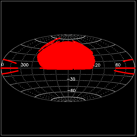
In the figure above we can see how the height of the rectangles in the Mollweide representation tapers to offset the increase in width as we approach the celestial Ecuador, so that the areas of all regions are identical to each other in the figure, like they are in reality.
I like how you've drawn these shapes, but is it possible to fill them in with colour? I'd like to use something like this to plot my data.
ResponderEliminarWhere the colour represents the value of my data in that area. Do you know how I might do that?
for those of you interested, it's easier than I thought. After each ax.plot(x,y) use ax.fill(x,y).
EliminarJust leaving a note here that:
ResponderEliminarAdd the following line
ax.set_xticklabels(map(lambda x: '$'+np.str(x)+'^\\circ $', tick_labels))
before ax.set_xticklabels(tick_labels) inside the plot_mwd function
to make the font and also ^\circ suffix in the xticks and yticks identical.